Design in Mampostea’o Based in Santurce Puerto Rico.


Brands Of is an organization that provides strategic and logistics tools to empower entrepreneurs and brands from the Latin American community, so they can connect with consumers around the globe.
They are an online seller that provide services on brand identity, brand architecture, strategy for marketers, products and services on these communities.
But how does Brands Of work as a brand itself?

The Task at Hand
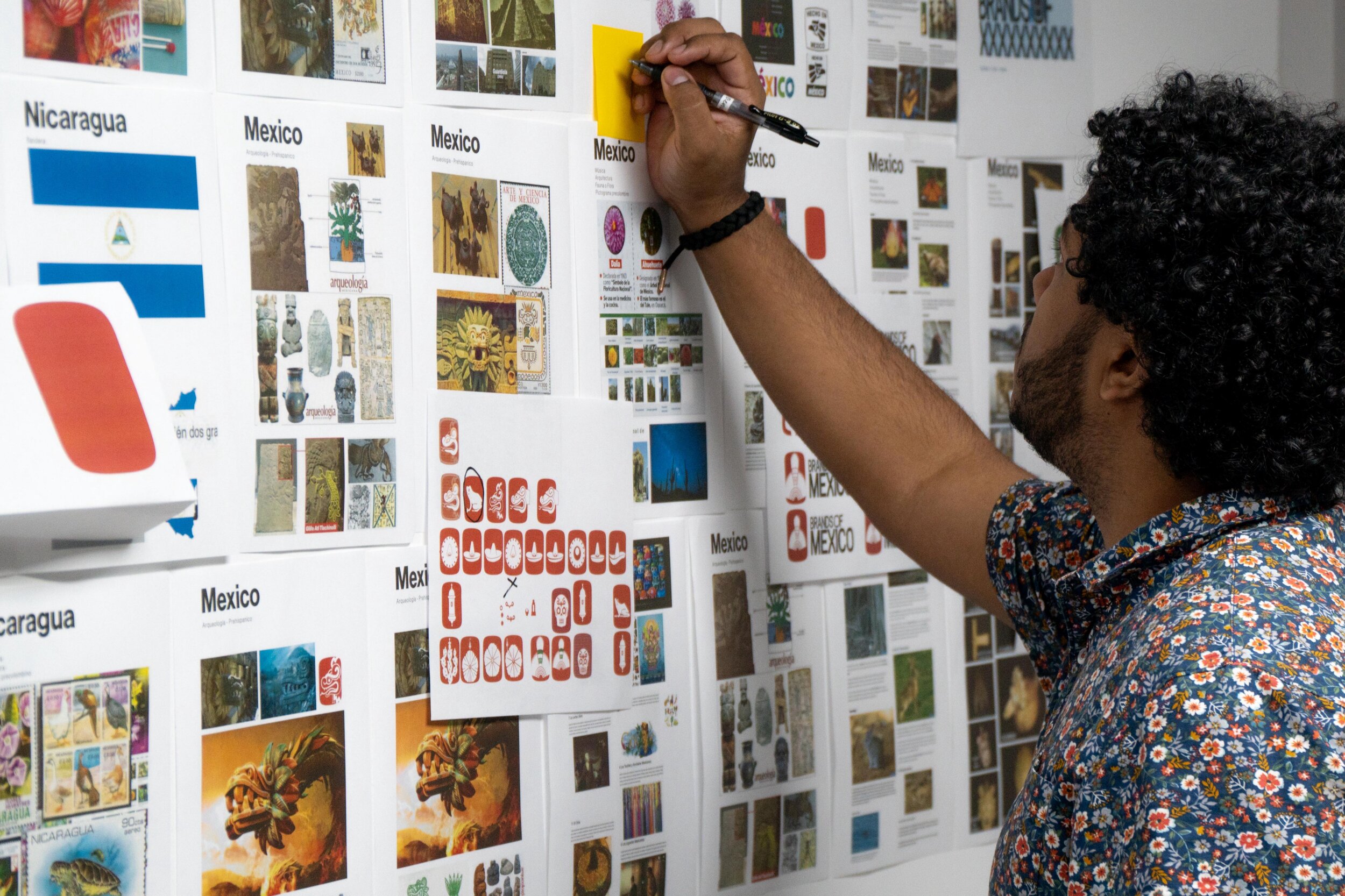
As design consultants, we headed to a challenging, yet very fulfilling task of bringing together all of these countries under one brand and here is part of our process and experience.
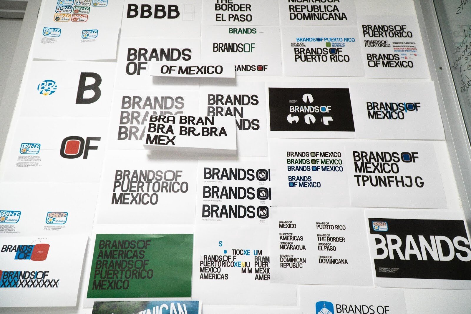
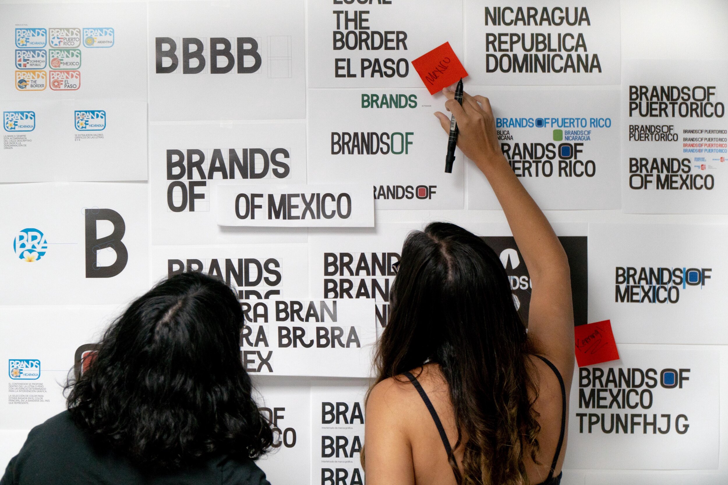
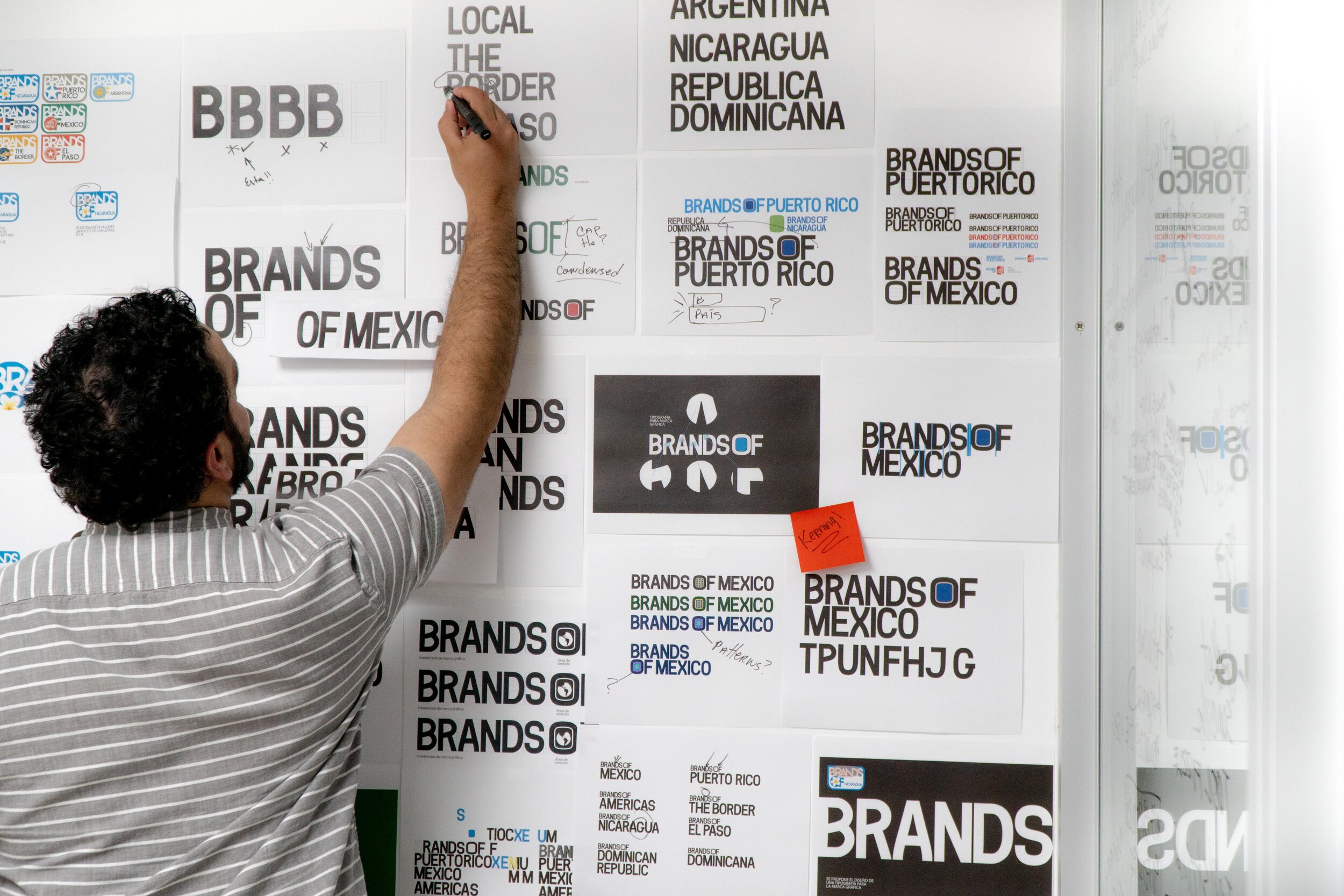
Thought this images I share the creative process for Brands Of as a whole, Brands Of México, Brands Of Dominican Republic and Brands Of Puerto Rico. Here you’ll get to know about those challenges we faced, but also how we achieved to make a successful brand strategy.
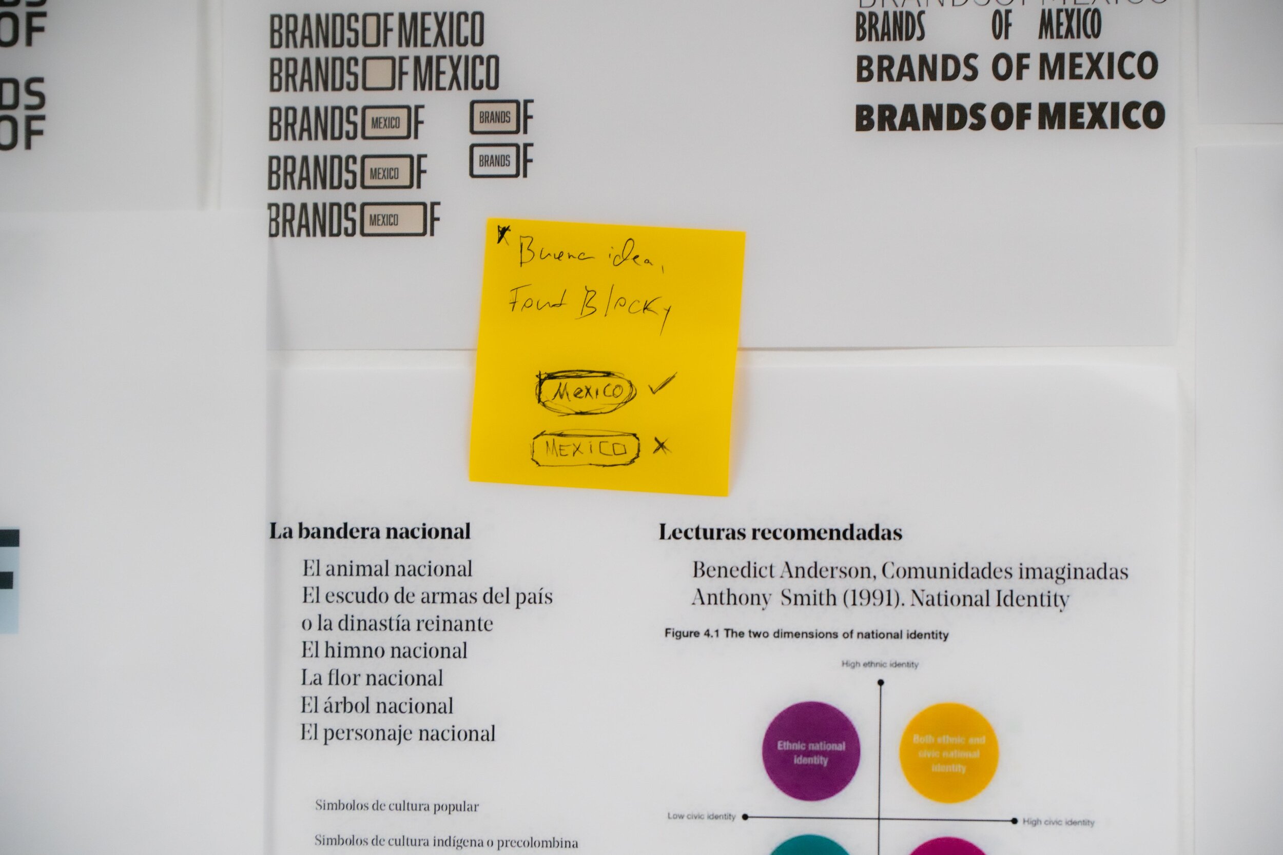
For the process it’s very important to have an editorial guide to reinforce the notions of the brand Strategy itself . Our main references was the theories of Anthony Smith (National Identity) and Benedict Anderson (imagined communities).
The existing Graphic Mark

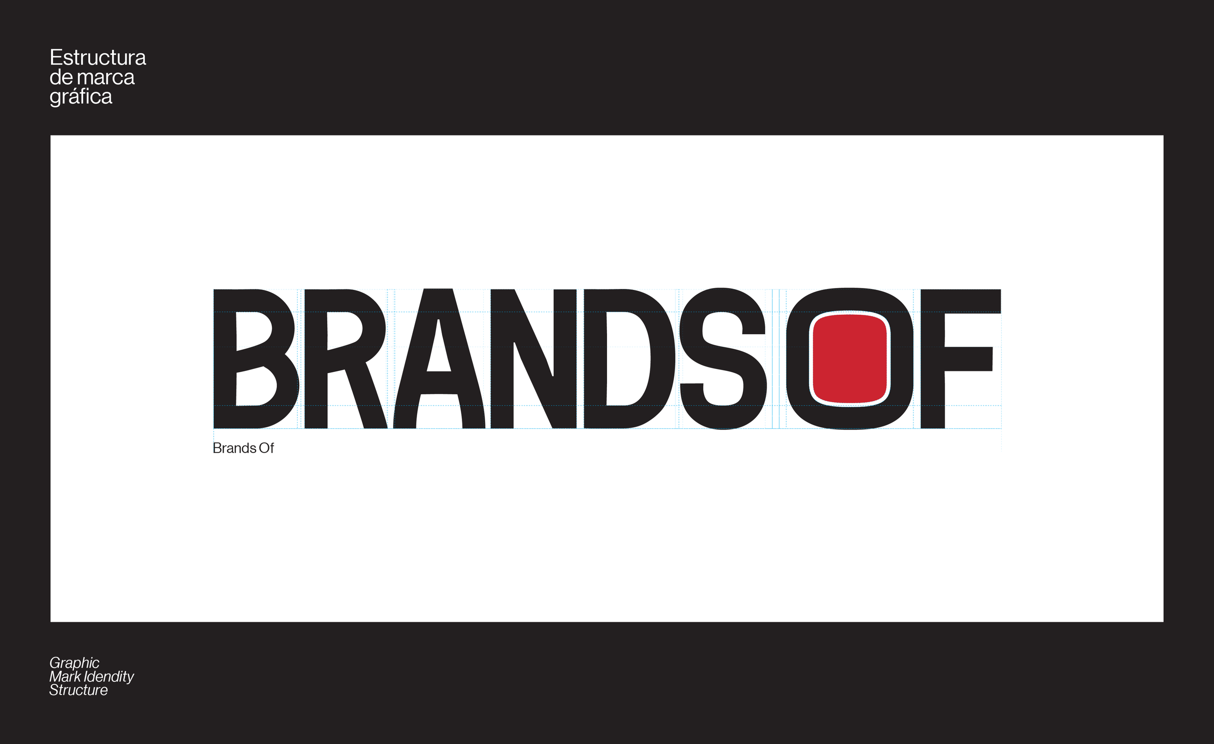
“We needed to redesign the original logo, so we focused on the elements that can still provide recognition for the brand.”
Typography development

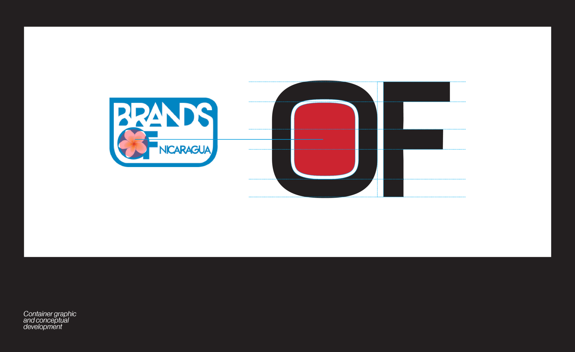
Graphic values from the letter “B” and “R”, and the use of the letter “O” as a container were elements that we wanted to explore with the new version of the Graphic Mark.
Typography & Structure


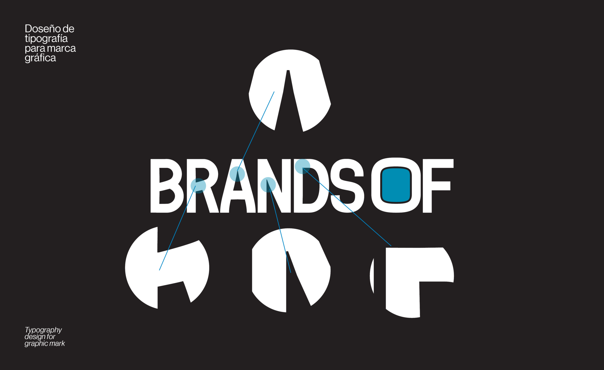
We embraced the strategy of providing a sense of culture and structure to strengthen the brand recognition.
¨We designed a brand that can be extended to every country, maintaining a strong relationship between the container, the symbols, the typeface and color application. ¨

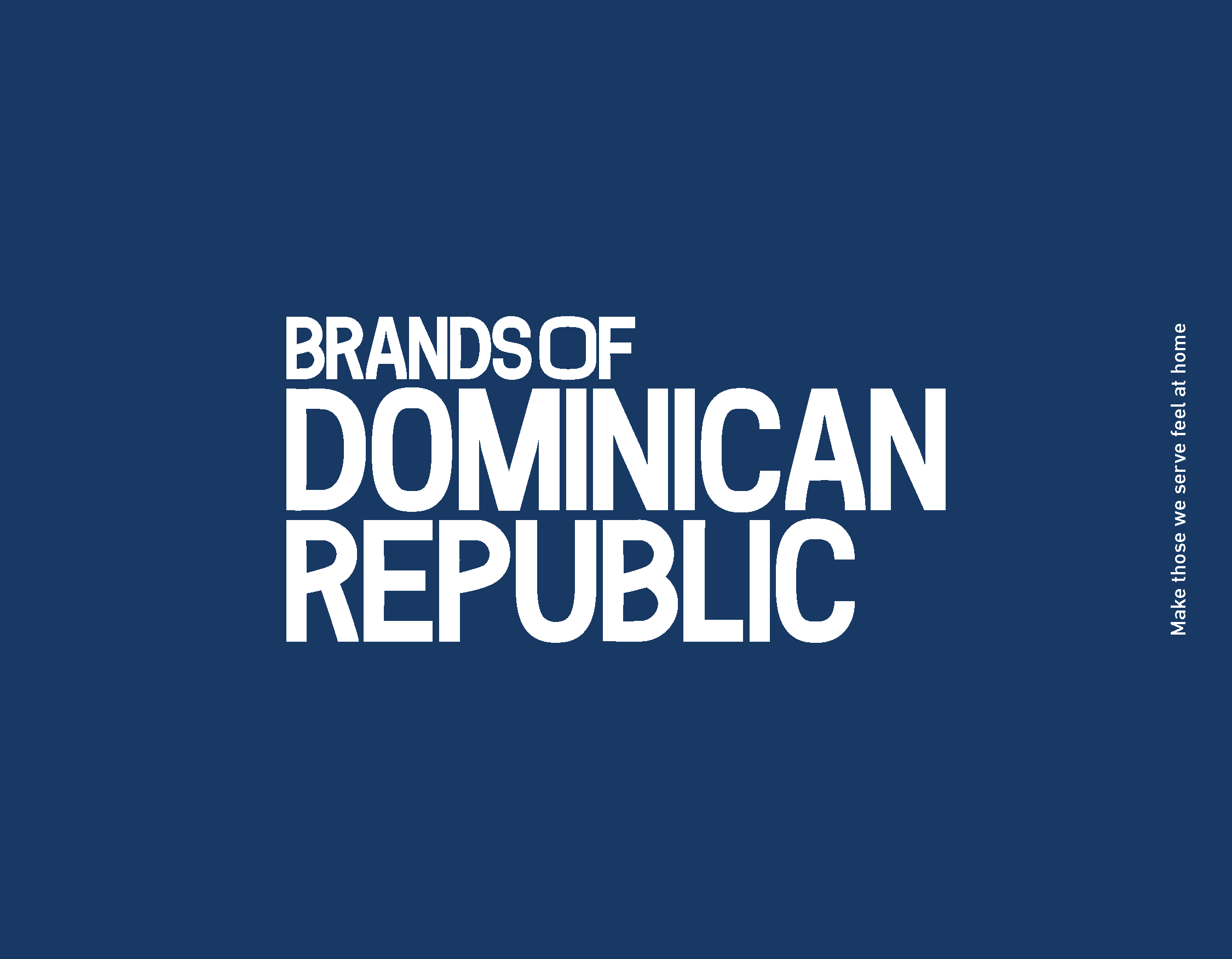
For the brand architecture, we tried variations of writing everything sideways, separated, etc., but here’s what happened. The name México is short, but in the case of Dominican Republic it was way too long. We opted for maintaining Brands Of together and placing the country’s name underneath it maintaining the visual language.
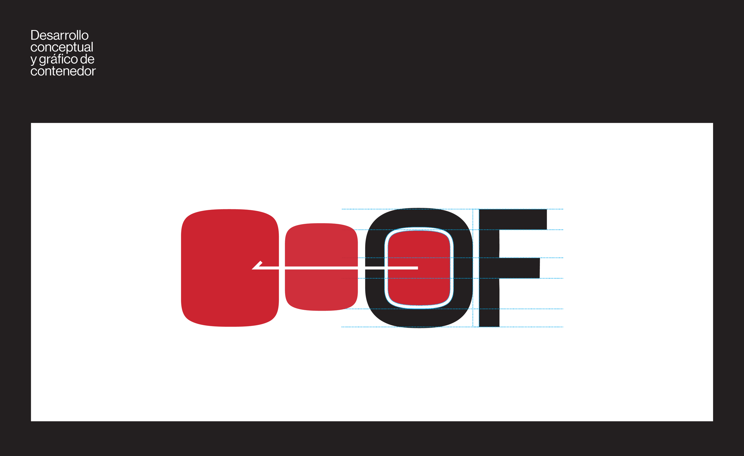
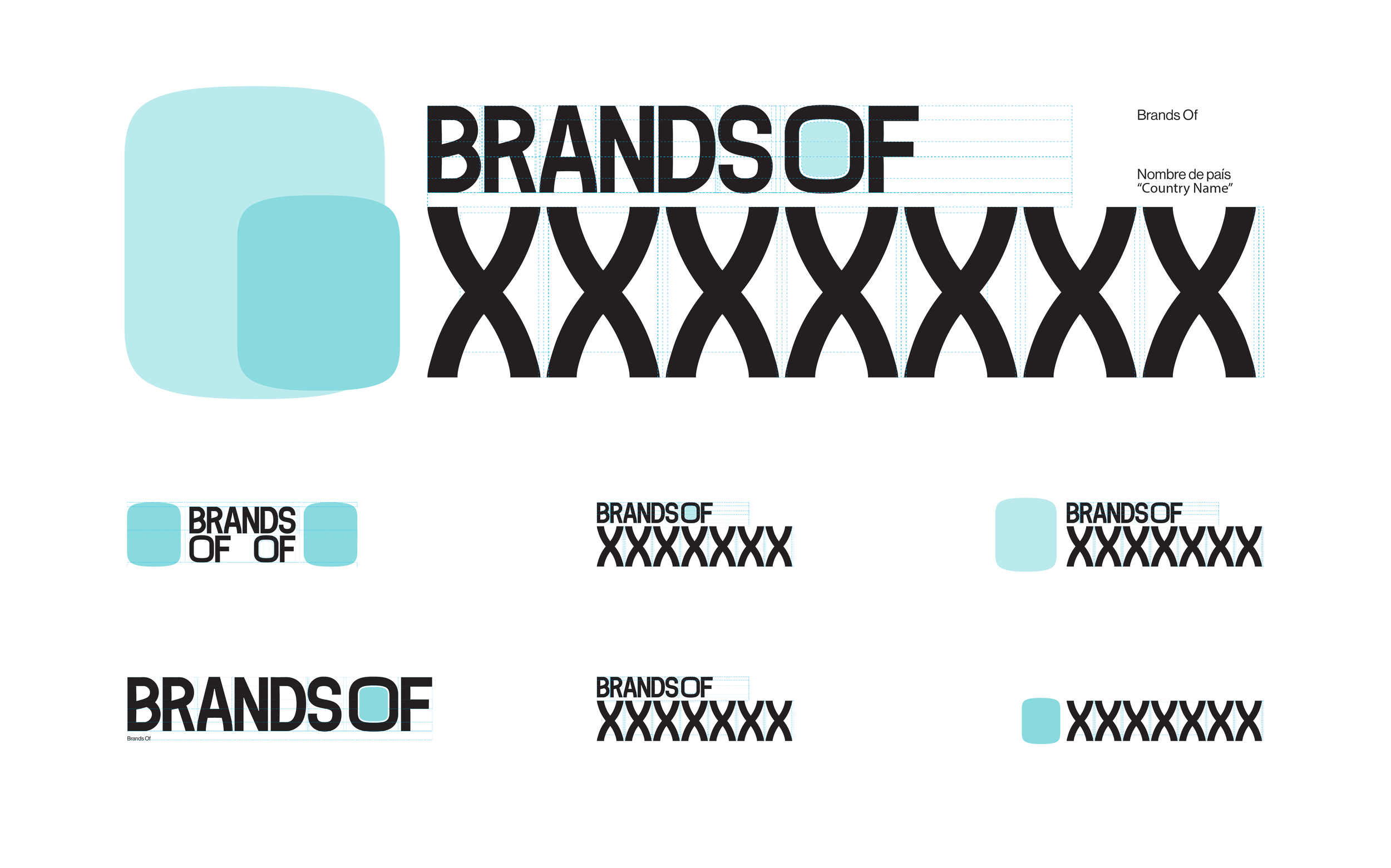
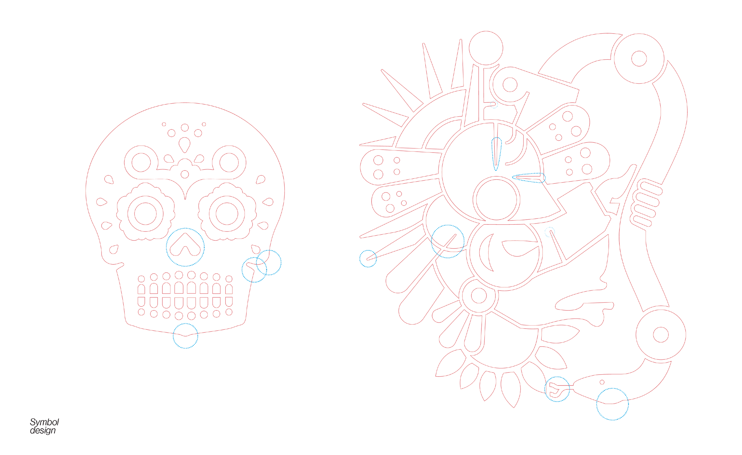
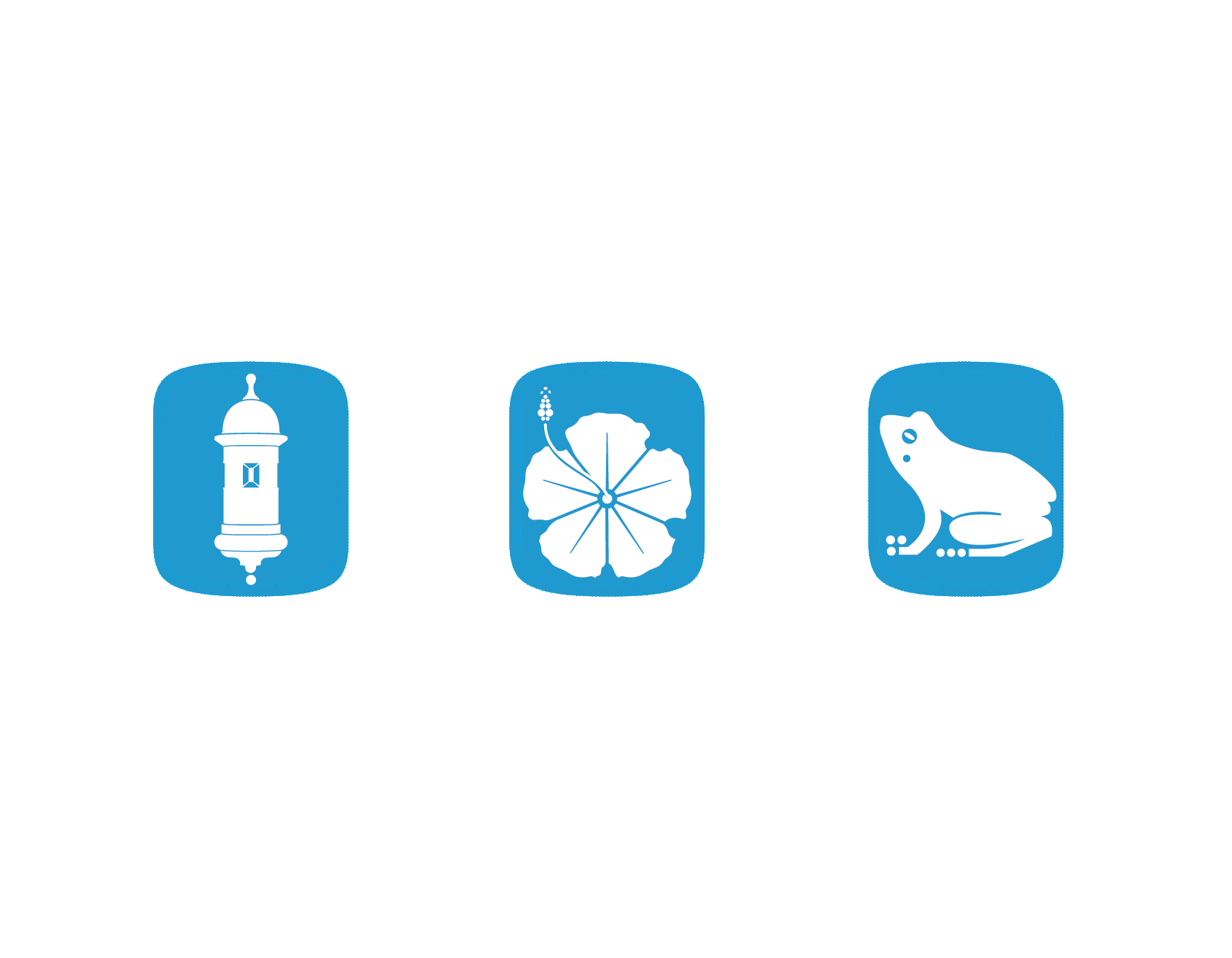
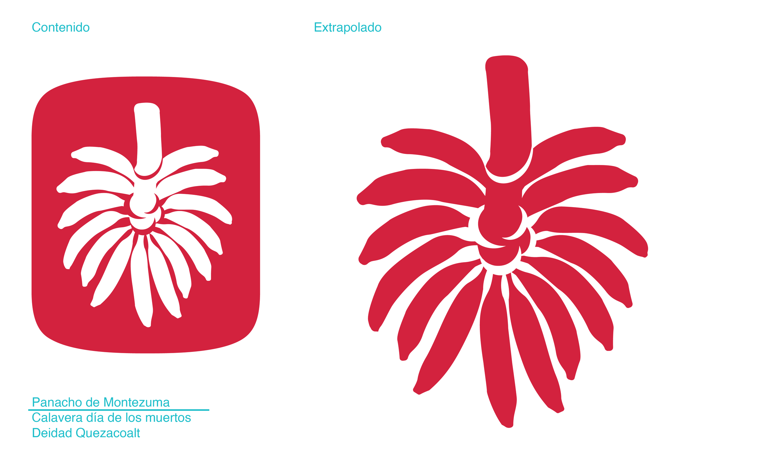
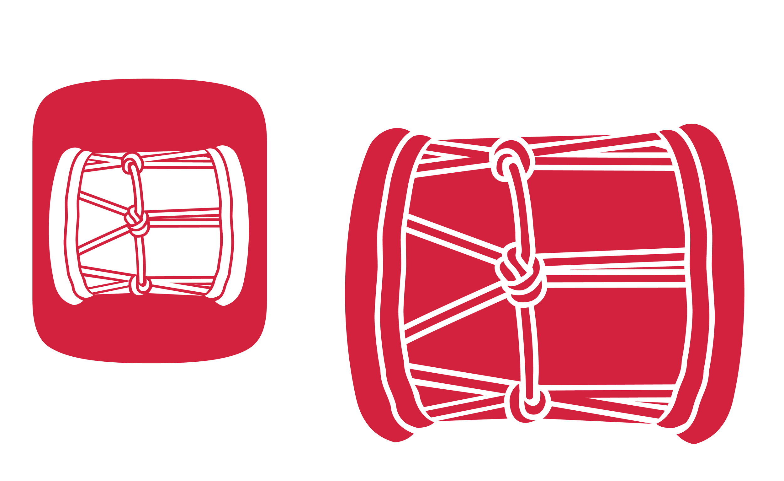
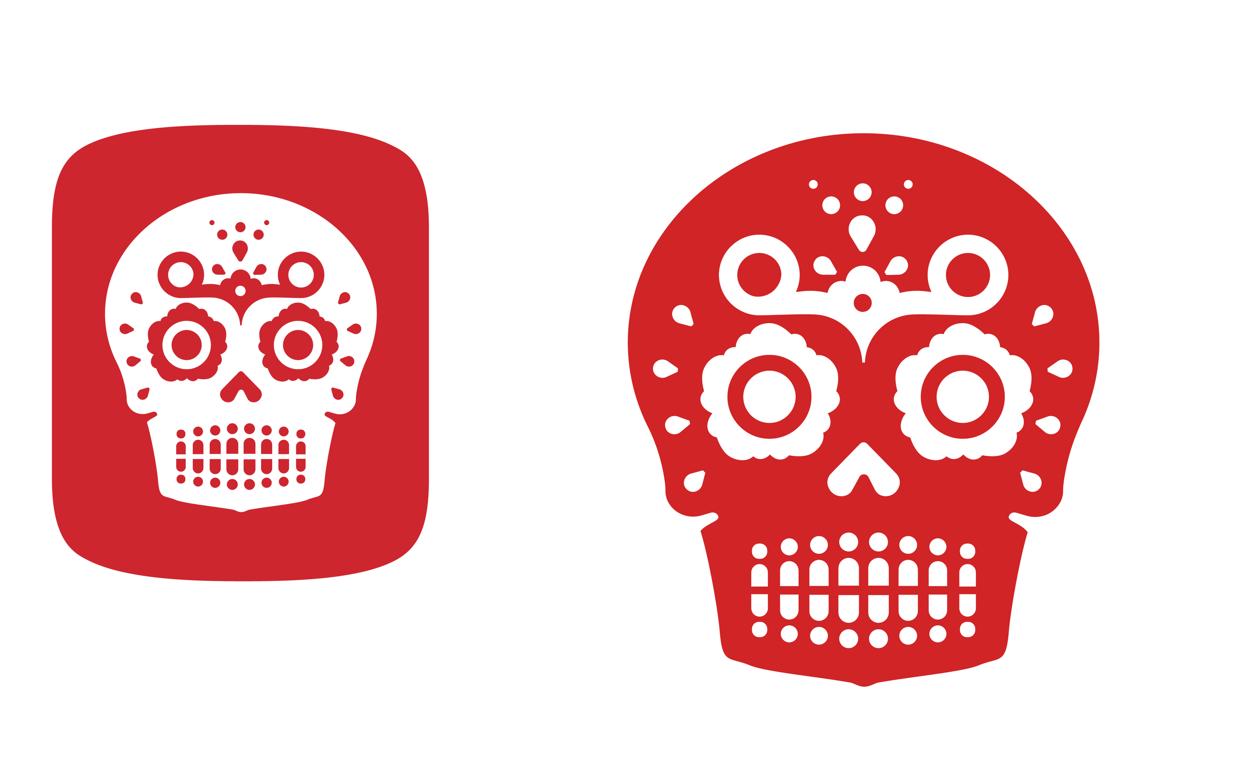
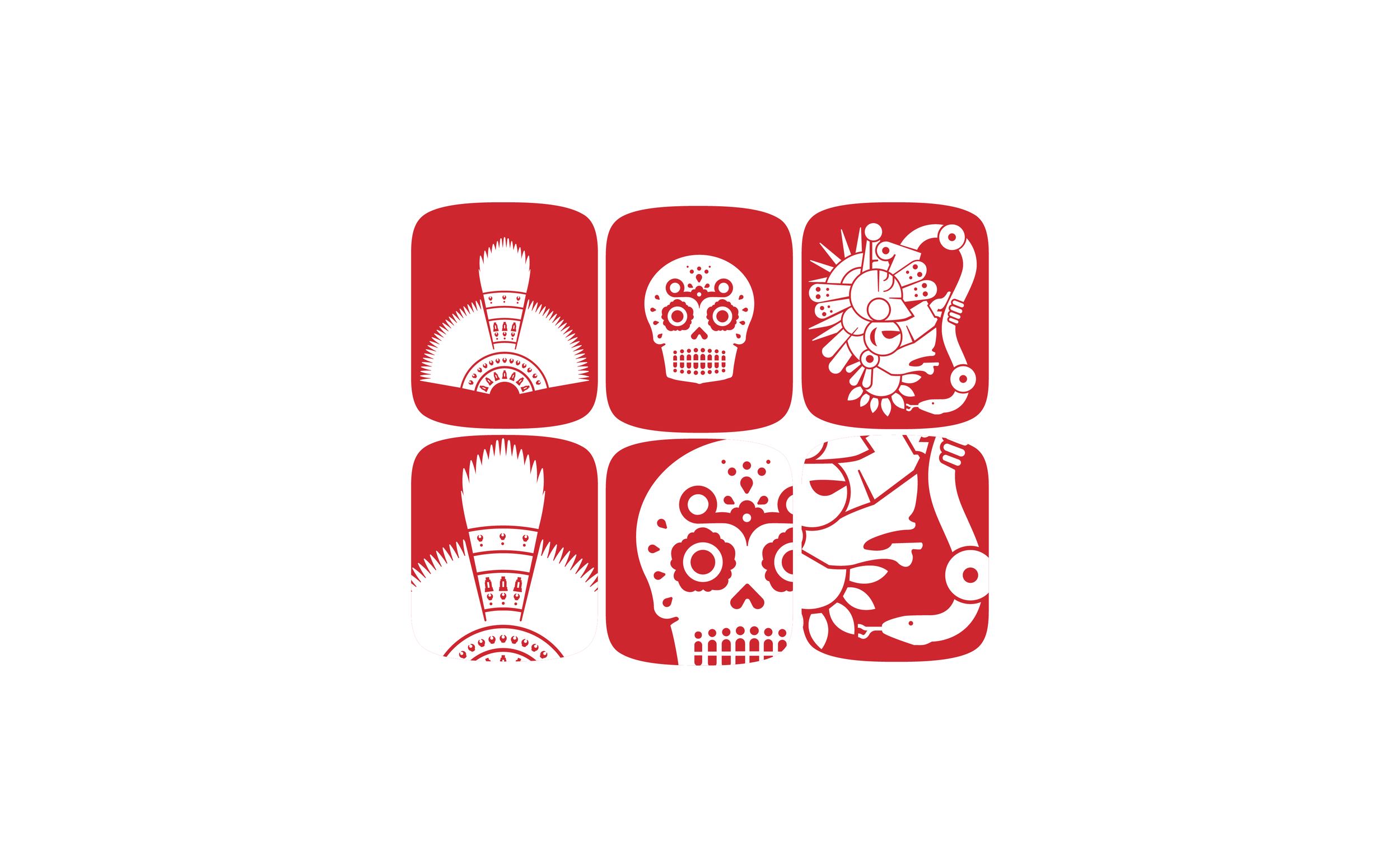
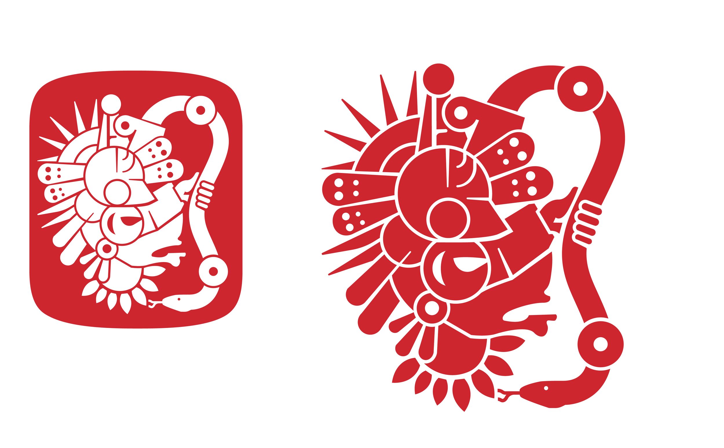
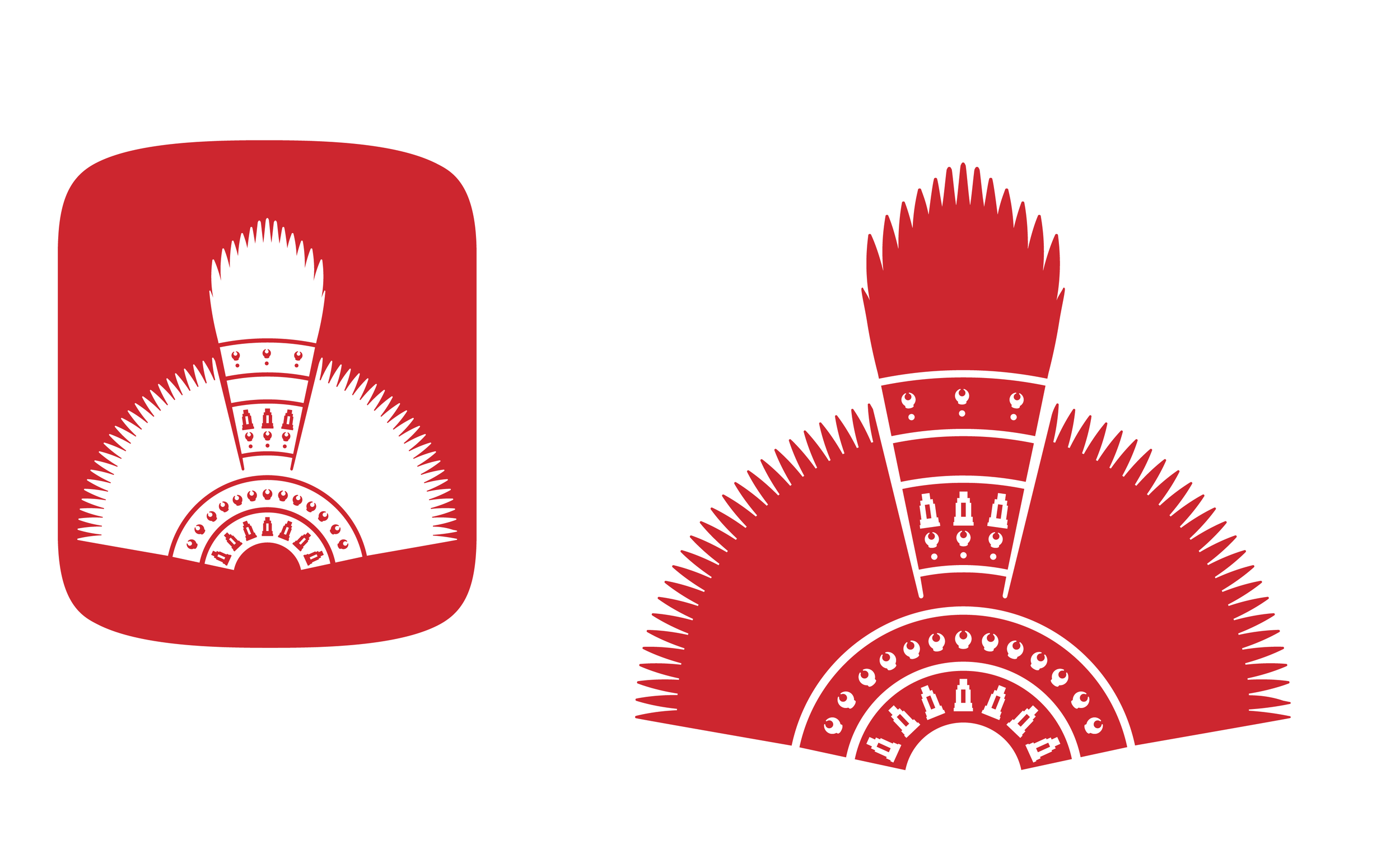
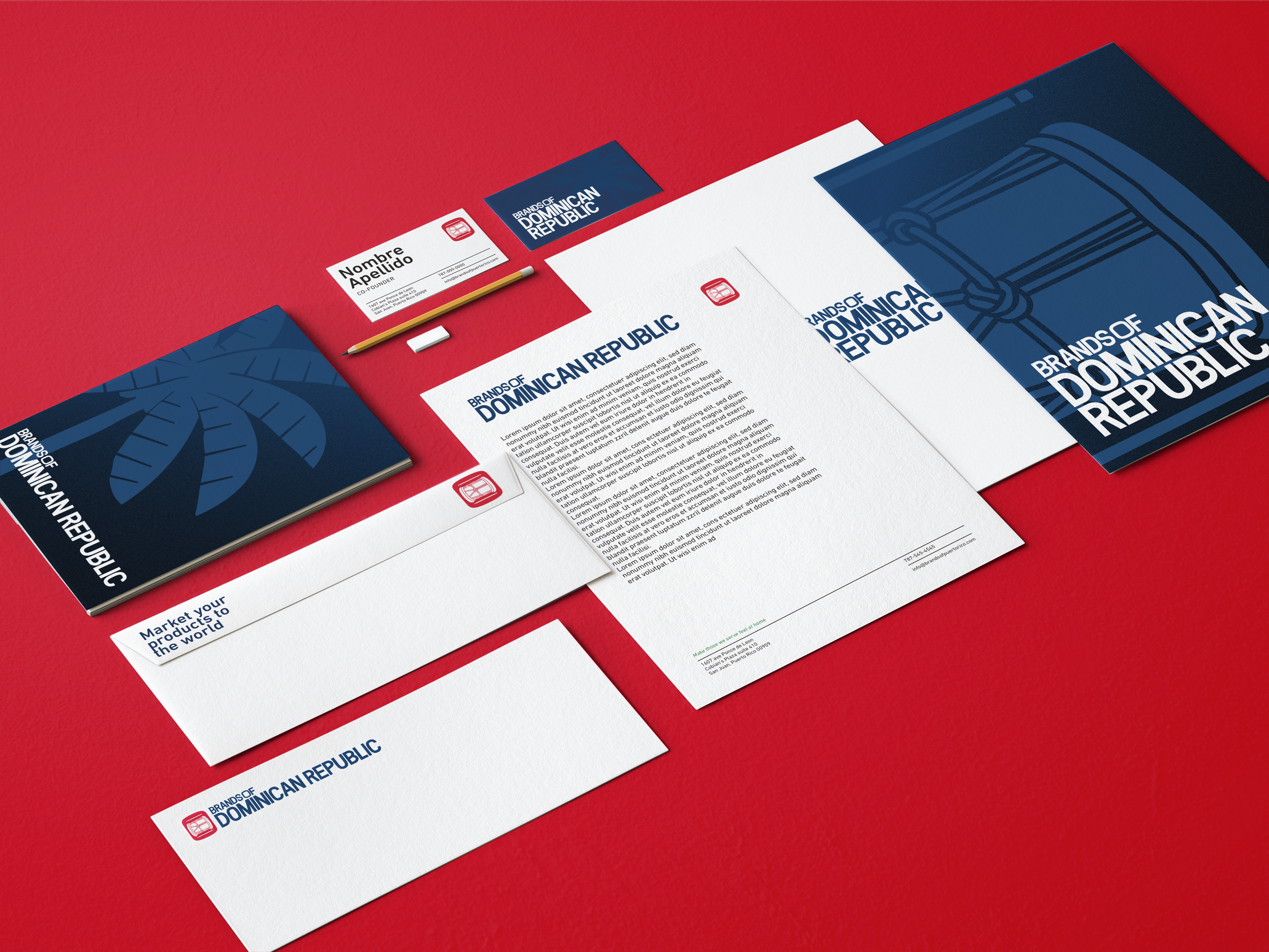
The token was specifically designed to be removed from the logotype and be used as a series of independent symbols that represent and differentiate countries culture itself.
Process
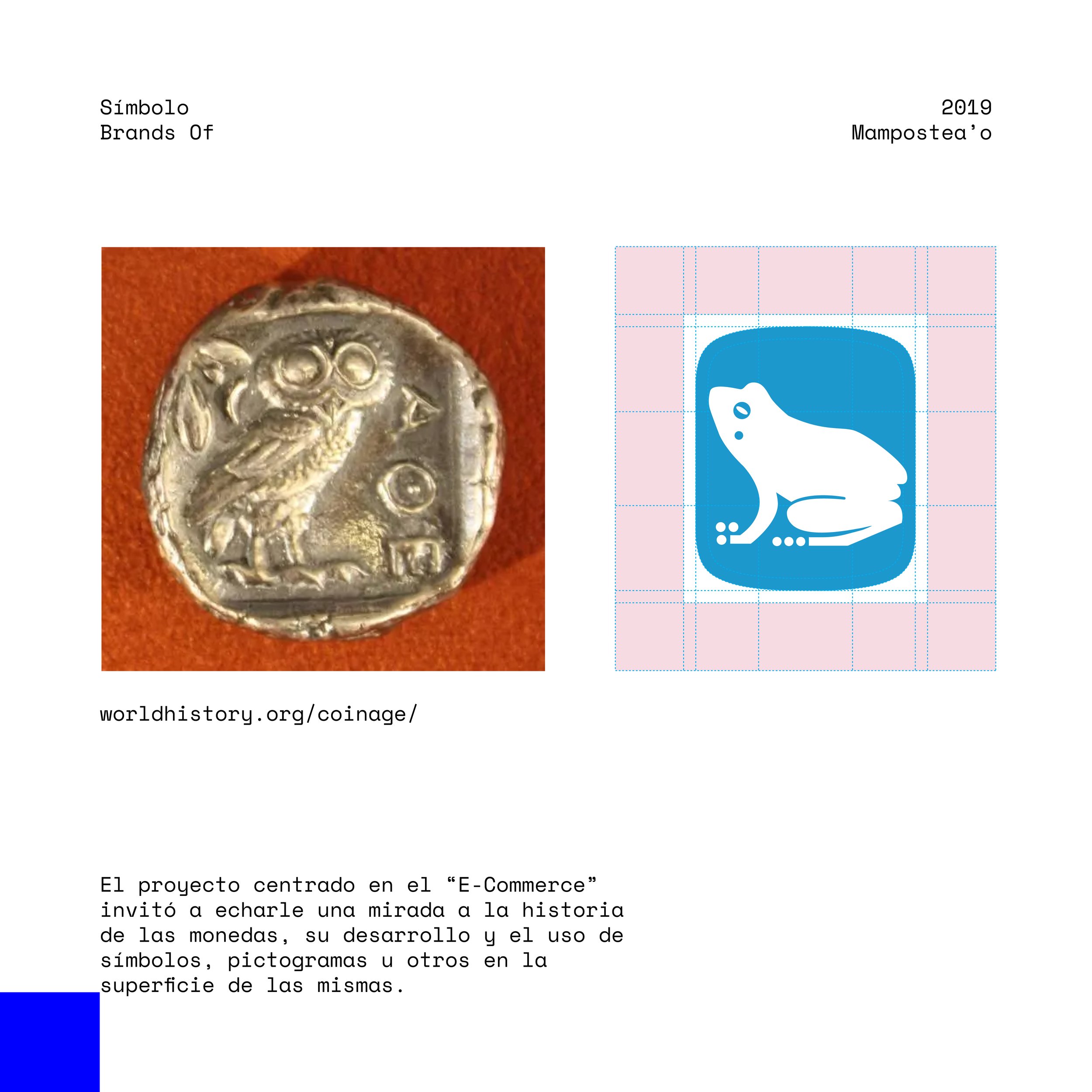
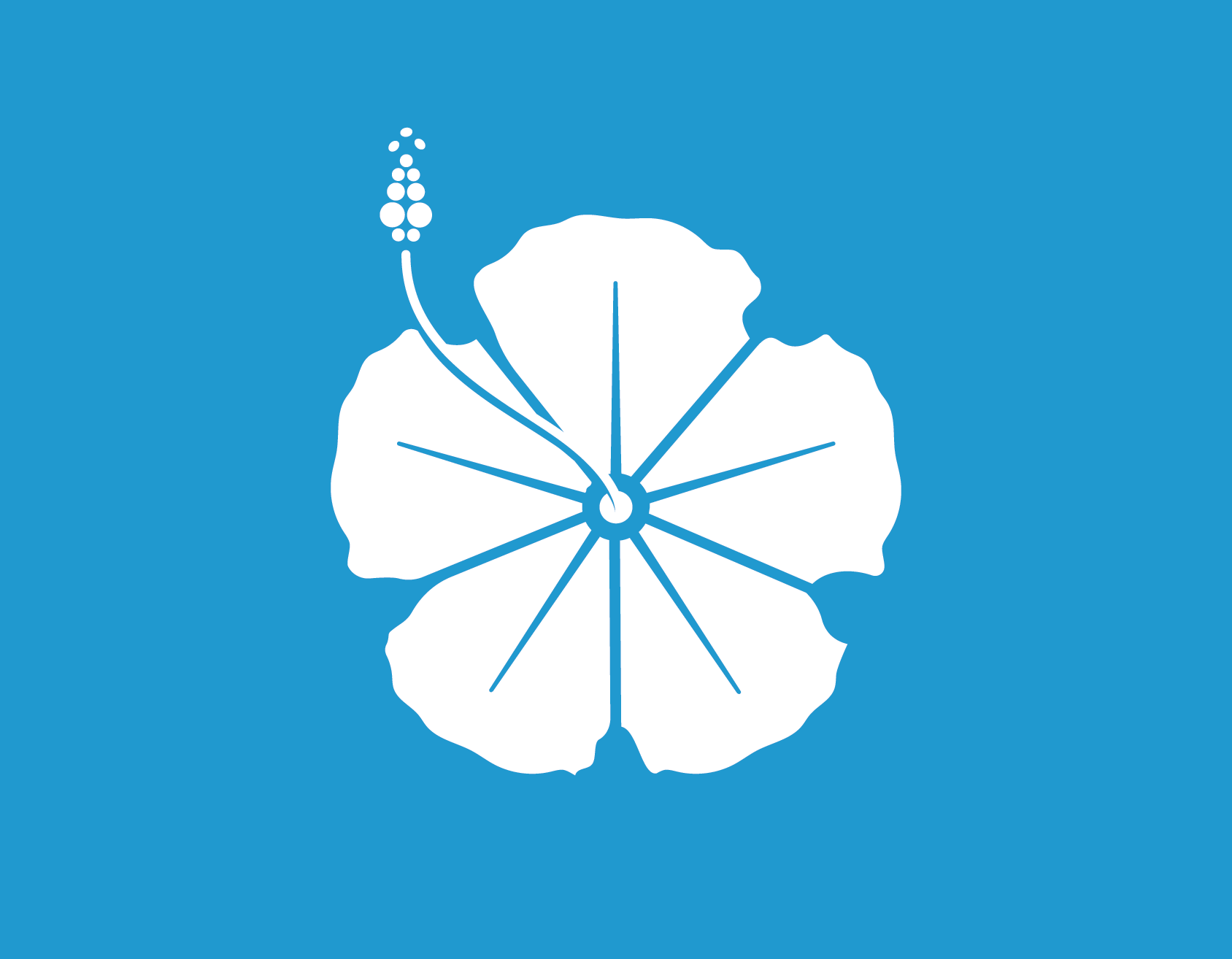
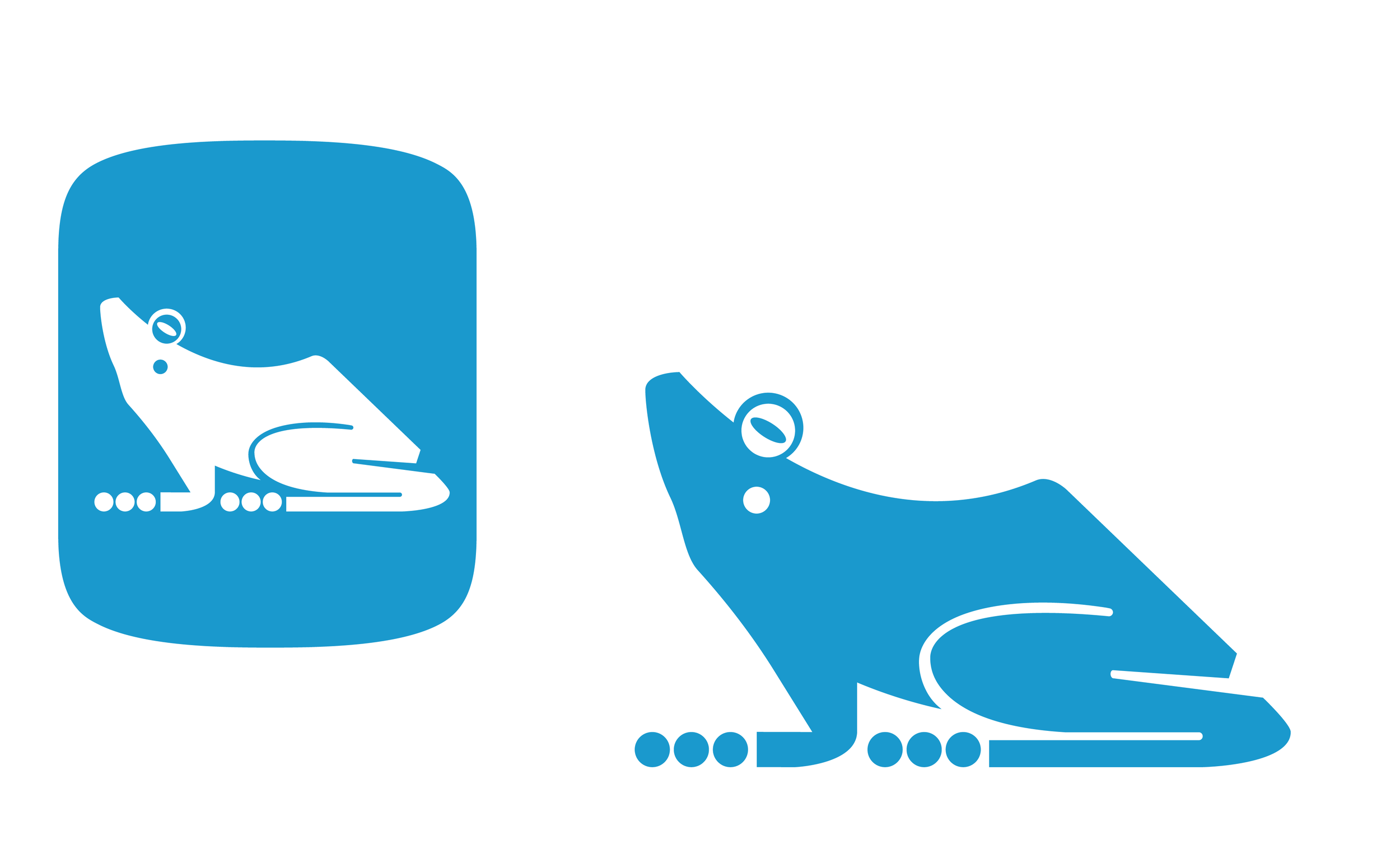
The Symbols
¨The design of the symbols will provide emotion and identity elements so audiences can relate to them.¨
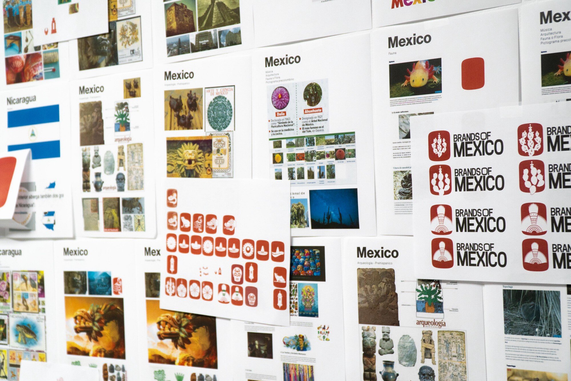
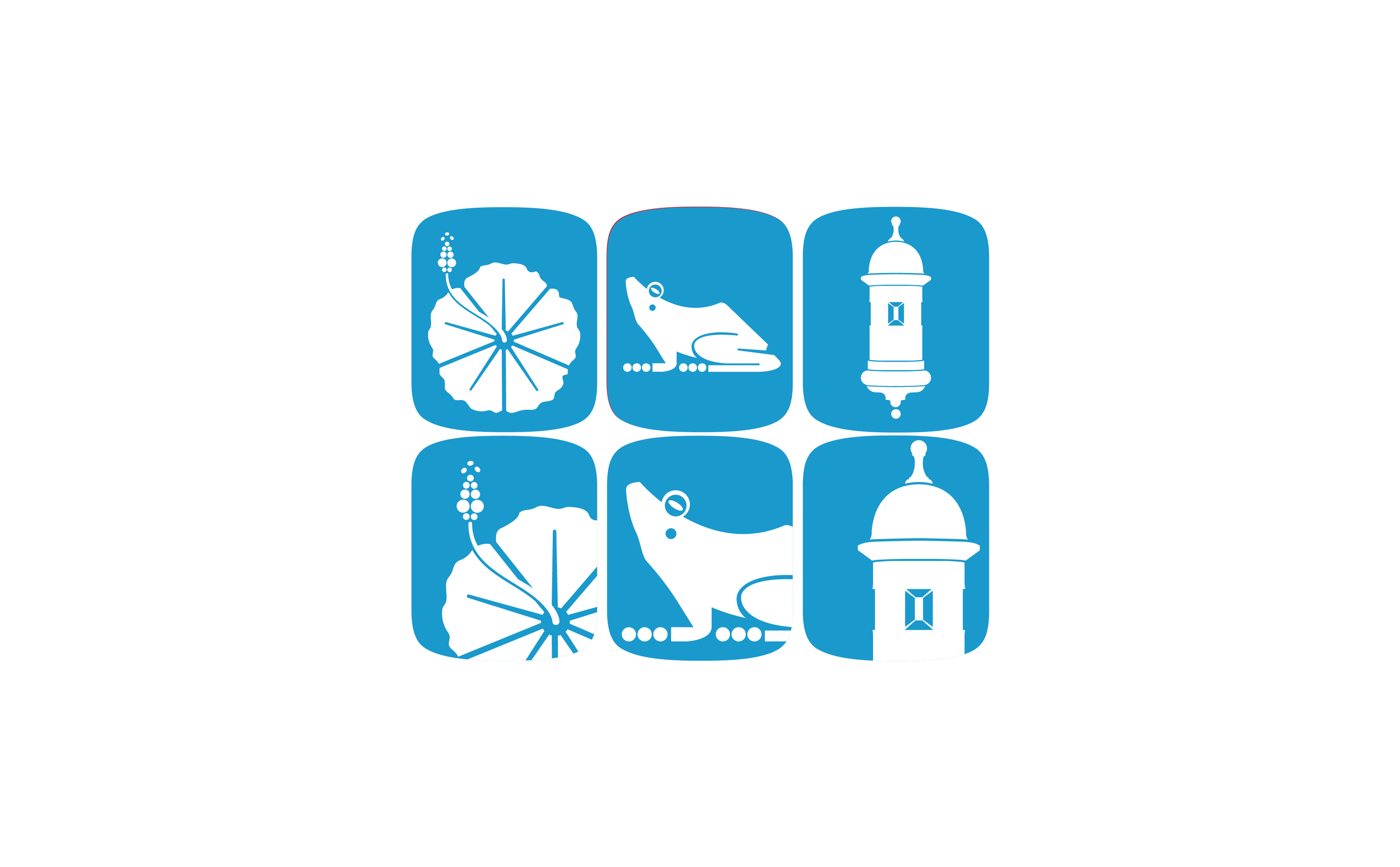
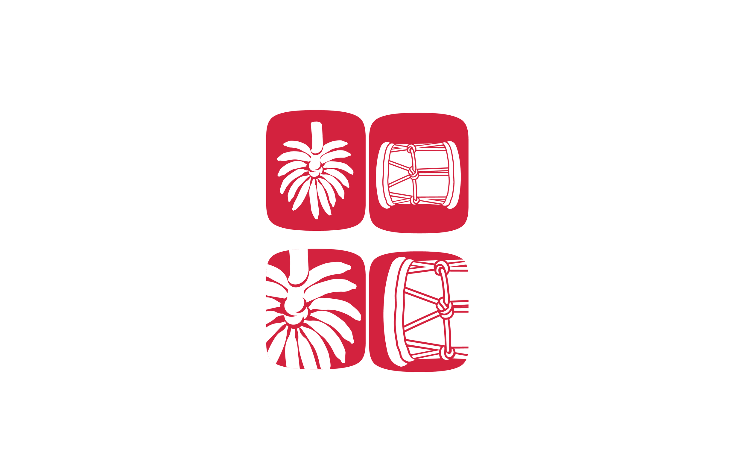
There will always be a debate in which people do not specifically identify with some symbols while others do. We went by the book and researched what are the most identifiable elements a country can have, and this is what we came up with as the symbols that are going to be used in the container:

National Fauna (Endemic)
National Flora (Endemic)
Architectural Heritage
Archaeological Heritage
Pre-hispanic
Popular culture

The Color Structure

One of the things that popped out immediately was the use of the flag as a main element that represent a country and its people. It is the one thing we can easily recognize and visually will bring structure to the color system application on every brand.
From the beginning, we knew we wanted to use the flag as a guide for color representation, but there were some challenges. The most evident problem was that some flags share the same color structure.
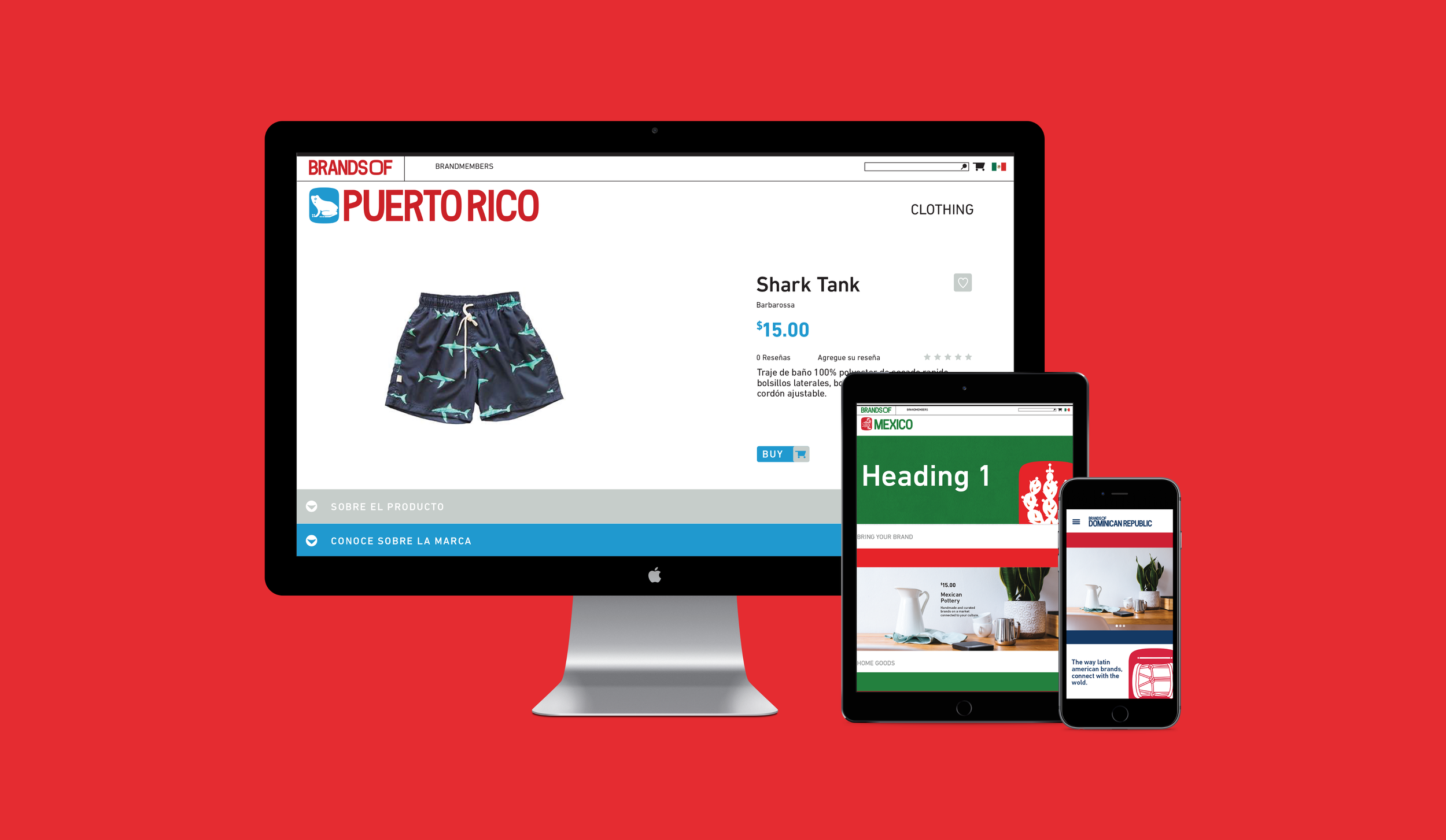
Brands Of México


Brands Of Dominican Republic
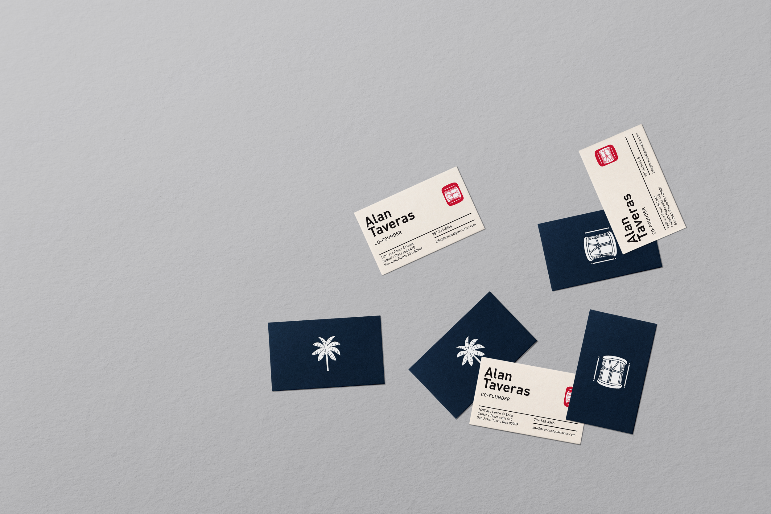
Brands Of Puerto Rico


Project Scope
Graphic Mark
Brand identity system
Type design
Design
Moises Cruz
Ramdwin González
Jonathan Asia
Uriel Osiris
Taymara Sánchez
Genesis Velez
Gabriel Openheimer
Photography
Ramdwin González